Es befinden sich keine Produkte im Warenkorb.
Plainly's award-winning design, developed in collaboration with Winkreative, the global branding agency led by Monocle's Tyler Brûlé, embodies the brand's innovative approach and Munich heritage through a minimalist aesthetic that celebrates transparency and functionality.

Winkreative, the global branding and design agency headed by Monocle's Tyler Brûlé, played a pivotal role in developing Plainly's award-winning design. The agency's approach focused on creating a timeless and iconic brand world that embodies elegance, modernity, and simplicity while incorporating moments of impact and sophistication.In crafting Plainly's visual identity, Winkreative adopted a strategy of stripping away excess to celebrate transparency and create a direct translation of the product and brand. This minimalist approach aligns with Plainly's philosophy of offering only the essential, both in product formulation and brand communication.The agency's design work for Plainly is characterized by several key elements:
Winkreative's design for Plainly successfully communicates the brand's commitment to luxurious natural ingredients and transparency. By stripping away excess and focusing on essential elements, the agency created a visual language that stands out in the beauty industry, where style often overshadows substance. This approach aligns with Plainly's mission to elevate hand care through a combination of premium ingredients and sophisticated design.The collaboration between Plainly and Winkreative demonstrates the agency's ability to create bespoke solutions that fit the business and culture of their clients. By leveraging their expertise in global branding and international trends, Winkreative helped Plainly craft a brand identity that is both locally rooted and globally appealing.
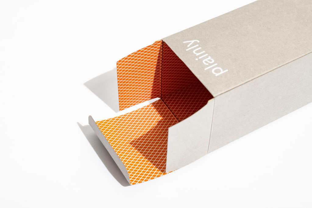
Plainly's design draws significant inspiration from its Munich heritage, incorporating subtle yet meaningful elements that reflect the brand's Bavarian roots. The diamond motif featured in the packaging design is a direct reference to Plainly's origins as a Munich-based brand, serving as a visual connection to Bavaria's rich cultural history. This geometric pattern not only adds a distinctive aesthetic touch but also reinforces the brand's local identity within a global market. The influence of Munich's architectural heritage is also evident in Plainly's design approach. The city's history of urban planning, particularly the principles implemented by Heimatschutz architects and planners to foster "Old Munich's" construction style, resonates with Plainly's commitment to timeless elegance. This connection to Munich's architectural traditions is subtly reflected in the clean lines and structured layout of Plainly's packaging and branding materials. Furthermore, the brand's color palette draws inspiration from the natural landscapes and traditional colors associated with Bavaria. The use of organic hues in the packaging, complemented by bright accents, creates a visual language that is both modern and rooted in the region's aesthetic heritage. This thoughtful integration of local color influences helps to create a unique brand identity that stands out in the global beauty market while maintaining a strong connection to its Munich origins. By incorporating these elements inspired by Munich's heritage, Plainly has created a brand identity that is not only visually appealing but also rich in cultural significance. This approach aligns with the growing trend of heritage-based design, which seeks to create contemporary products and experiences that are informed by and respectful of local traditions and history.
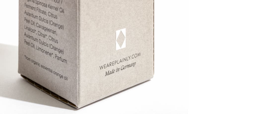
Plainly's commitment to sustainability and functionality is evident in its packaging design, which aligns with contemporary eco-friendly trends while maintaining a luxurious aesthetic. The packaging, produced by Munich-based printer Seismografics, is formed from Gmund Colors Matt cardstock, selected for its exceptional quality, sustainability credentials and superior tactile experience. Expert packaging technologists, screen and offset printers, and master bookbinders collaborated to develop and produce the sophisticated design flawlessly.
