Design Philosophy
Our Packaging
Developed with Winkreative, the global branding agency led by Monocle's Tyler Brûlé. Every detail reflects our commitment to transparency, sustainability, and the art of plain luxury.

The Winkreative Collaboration
Designed for Clarity
When we approached Winkreative, we shared a single vision: create packaging that embodies what's inside. Tyler Brûlé's agency is renowned for stripping away excess to reveal essence— exactly what our formulas do for skin.
The result is a design language that speaks through restraint. No loud colors. No excessive branding. Just honest materials, thoughtful proportions, and details that reward closer inspection.
This collaboration earned us the prestigious iF Design Award 2023—recognition that thoughtful design can elevate everyday rituals into moments of plain luxury.
iF Design Award 2023 winner
Winkreative · Quality Works · Autumn 2023
An elegant hands-on experience
Winkreative, Tyler Brûlé's branding agency, included our collaboration in their annual editorial showcase of recent work — alongside projects for Explora Journeys, History (Toronto), Airside (Hong Kong) and Tori Richard.
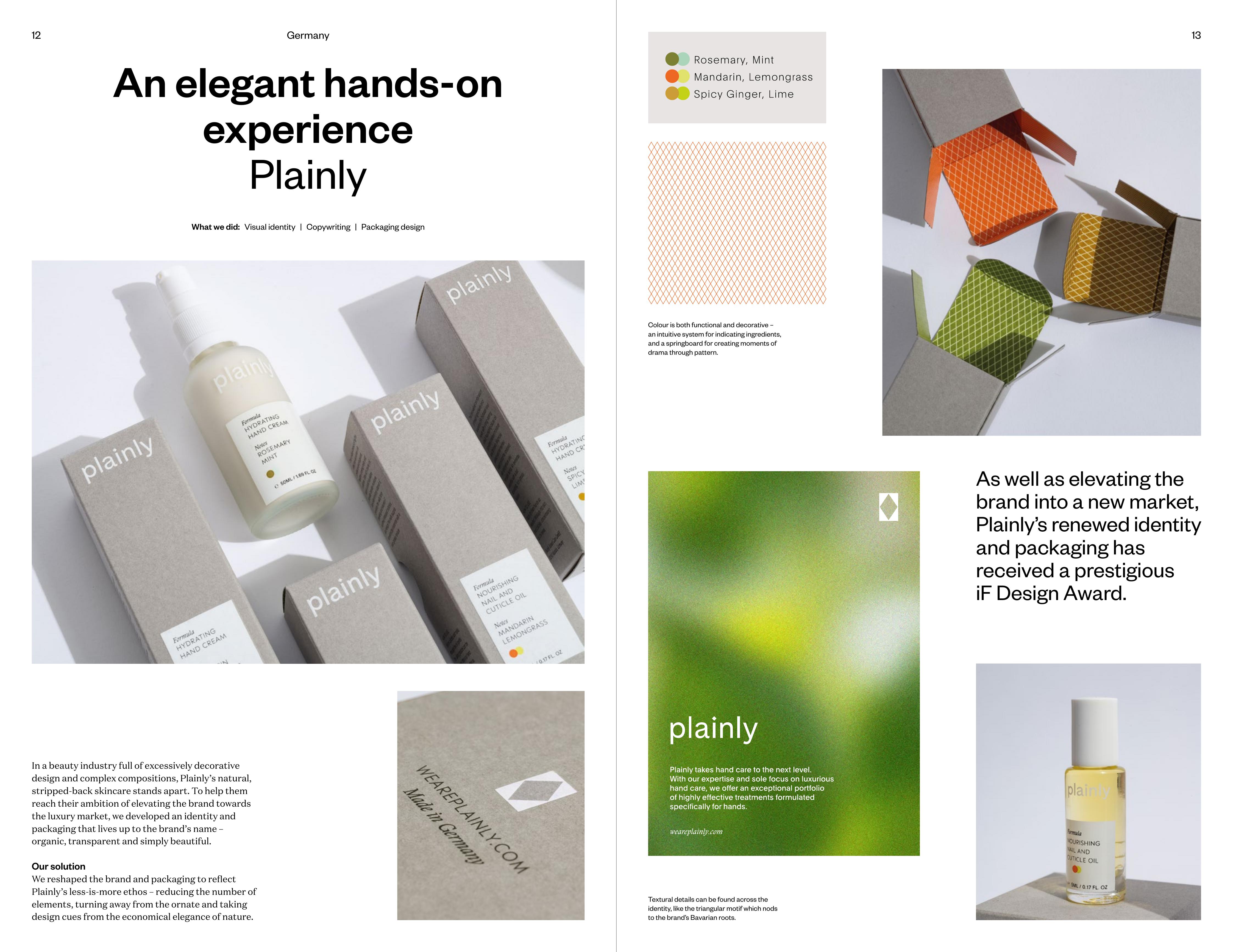
"Plainly's natural, stripped-back skincare stands apart… organic, transparent and simply beautiful."
Every Detail Considered
Design Elements
Sand-Blasted Glass
Our bottles feature a distinctive sand-blasted finish that enhances grip and creates a soft, tactile experience. Each bottle is sized to fit comfortably in your hand—an invitation to slow down and savor the ritual.
Screen-Printed Labels
Traditional paper labels are replaced with screen-printing directly onto the glass. This creates a seamless, durable finish that feels as refined as the formulas within.
Color Dots
Subtle color dots on each package represent the scent within—a visual language that makes choosing your product intuitive. These coded markers are your guide to finding your signature scent.
Gmund Paper
Our outer packaging uses Gmund Colors Matt paper from Lake Tegernsee in Bavaria. CO₂-neutral and Cradle to Cradle Certified® Silver, it represents the pinnacle of sustainable luxury.
Moment of Surprise
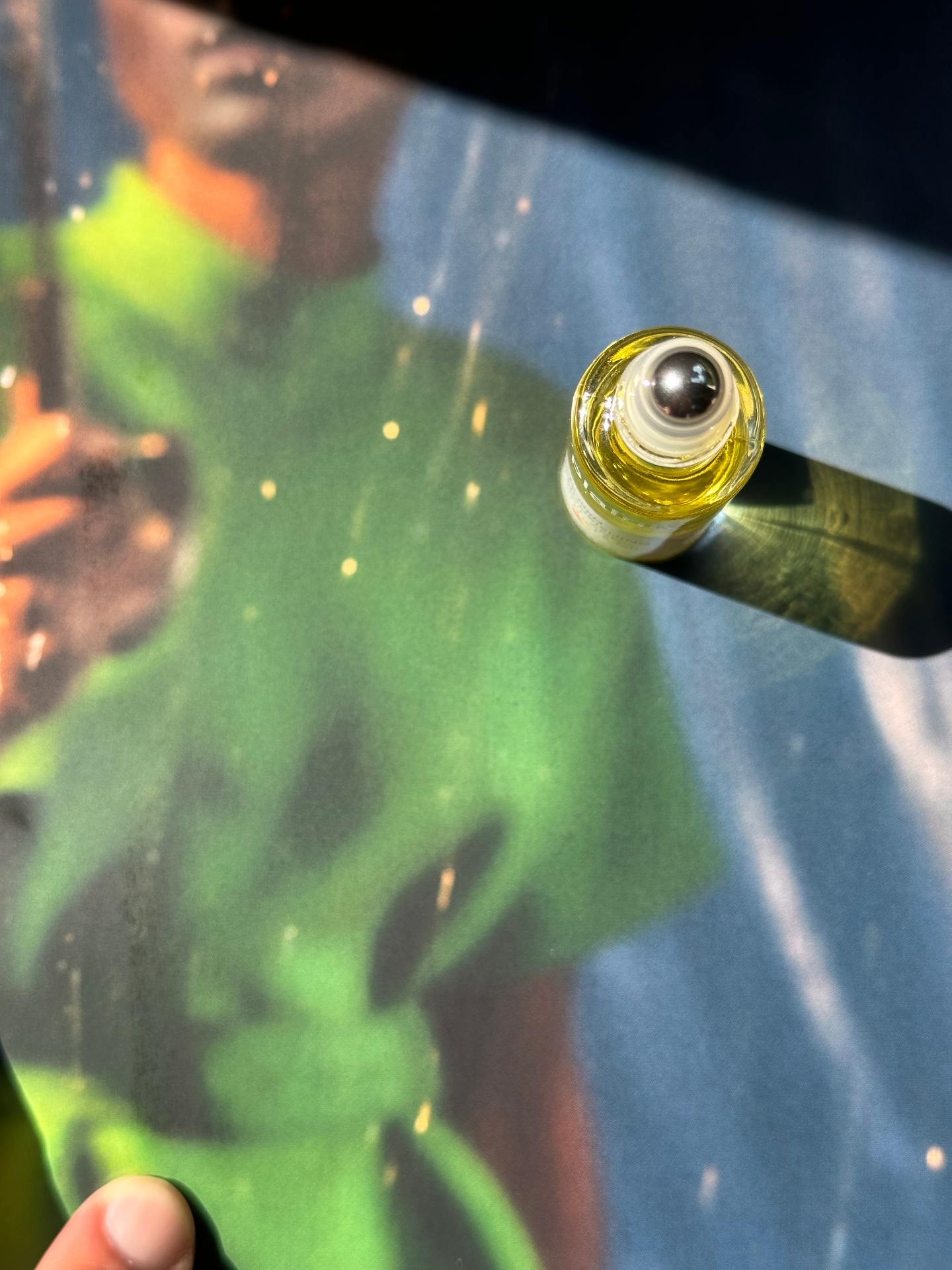
Open a Plainly box and discover a burst of color inside. The interior paper matches the scent—a hidden reward that turns unboxing into a multisensory experience.
Seismografics Printing
Every box is printed by Munich's master craftsmen at Seismografics, using techniques that honor traditional German printing while meeting the highest environmental standards.
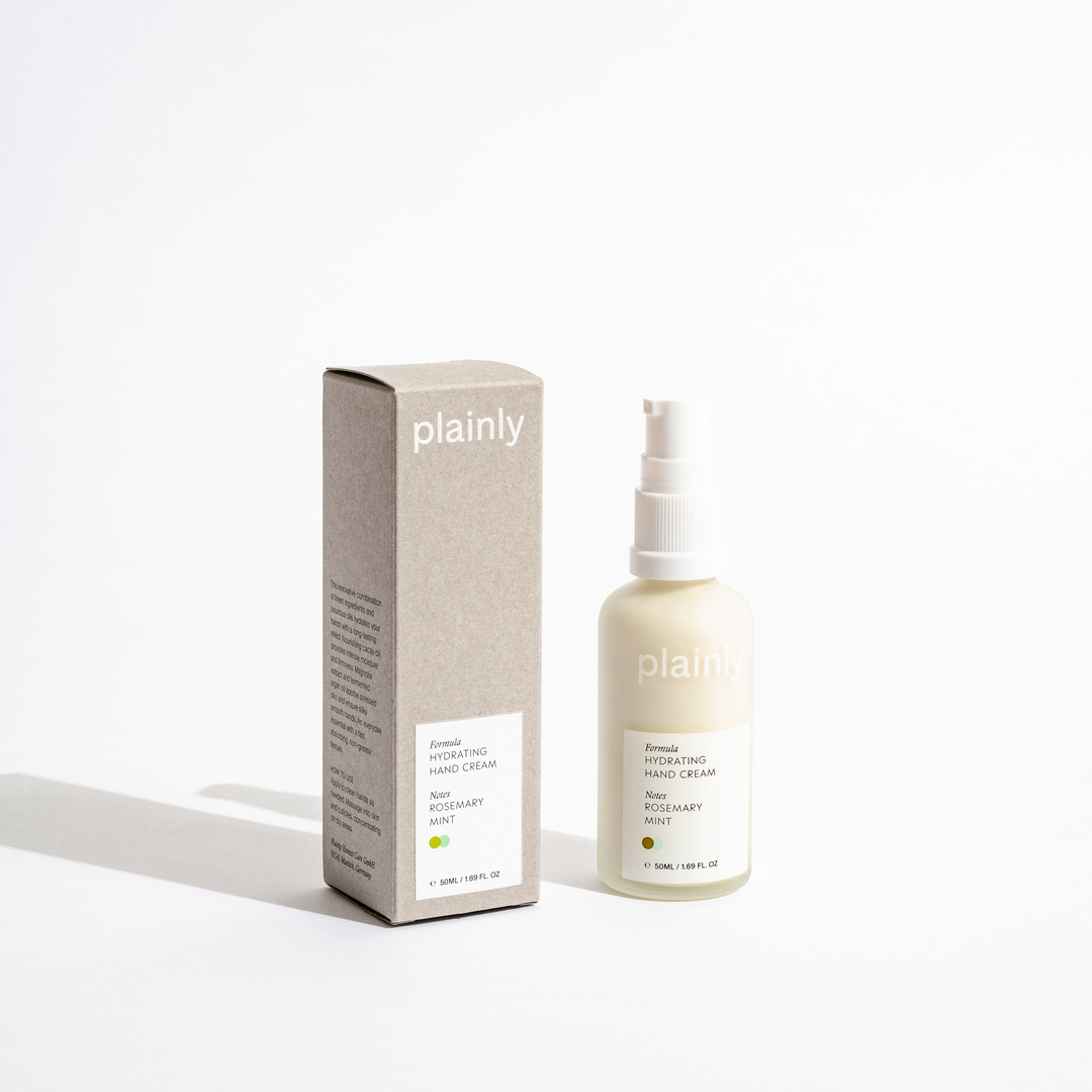
Gmund paper—materials chosen for their feel as much as their look
Responsibility
Sustainable by Design
Every packaging decision reflects our environmental commitment. Recyclable glass, FSC-certified paper, vegetable-based inks, and carbon-neutral production. Beauty shouldn't cost the earth.
Experience the Difference
Discover products where every detail—inside and out—reflects our commitment to plain luxury.
Shop Now